
Use hue, value, saturation, proportion, and material testing to build a coherent, commercial color system for an apparel collection.
Color theory becomes useful in fashion when it helps a team make repeatable product decisions. A palette must work across fabric surfaces, skin tones, trims, artwork, product photography, and a commercial assortment, not only on a digital mood board. The goal is not to follow a rigid wheel formula. It is to control hue, value, saturation, proportion, and context so every color has a clear role in the collection.
Start with the role of color
Before selecting shades, decide what color needs to achieve. Is it the main reason the customer notices the product? Does it establish a recognizable brand code? Does it make a technical garment easier to coordinate? Is it intended to become a replenished core or a short seasonal test? A palette designed for social impact can fail at retail if it creates too many isolated statement pieces.
Write three inputs: the customer, the product use, and the commercial role. Then gather references from environments, objects, art, material, and culture rather than copying another brand's assortment. References should communicate relationships, warm against cool, pale against dark, clean against weathered, not just a collection of attractive swatches.
Control hue, value, and saturation
Hue is the color family, such as blue or red. Value describes how light or dark it appears. Saturation describes intensity. Fashion palettes often become more coherent when the team controls value and saturation as deliberately as hue.
A group of different hues can feel related when they share a muted character. A monochromatic range can still provide strong contrast when it spans pale, mid, and dark values. Test the palette in grayscale to see whether products, panels, or graphics that need separation have enough value contrast. Then return to color and inspect whether one highly saturated shade overwhelms the range.
| Relationship | How it can work in apparel | Common risk |
|---|---|---|
| Monochromatic | One hue family across several values or intensities | Garments merge visually when values are too similar |
| Analogous | Neighboring hues create a smooth, related story | The assortment may lack a clear focal color |
| Complementary | Opposing families create energy and emphasis | Equal proportions can feel loud or competitive |
| Neutral plus accent | Commercial core colors support one memorable signal | The accent becomes decorative rather than connected to product use |
Build a commercial palette
Assign colors to roles instead of approving a flat list. A practical collection might use one or two core neutrals, a supporting family, a controlled accent, and a graphic or trim color. Decide which colors repeat across categories and which belong to one product only. This helps customers combine items and helps the business consolidate fabric, rib, thread, zipper, and label decisions where appropriate.
- Core: expected to carry more stock depth and remain easy to coordinate.
- Support: adds breadth without competing with the collection's central message.
- Accent: used in controlled proportion for recognition, energy, or wayfinding.
- Bridge: connects two otherwise separate color groups across outfits or categories.
Map each proposed color against the actual products in the product catalog. A light shade that suits a structured jacket may create opacity concerns in leggings or a fine tee. Color allocation must consider product construction, not only merchandising.
Test color on real materials
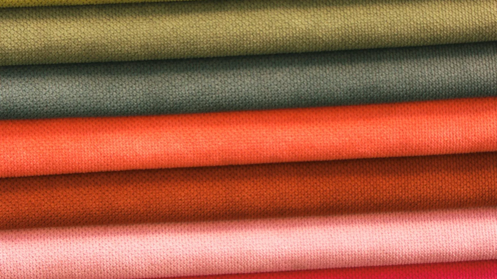
Digital colors are directions, not fabric approvals. Fiber, yarn texture, knit or weave, finish, pile, gloss, and lighting all change perception. The same color target may look deeper on brushed fleece, clearer on smooth jersey, and broken on a marl yarn. View lab dips or strike-offs on the intended base material.
Assess color under more than one relevant light source, then compare samples side by side against the approved standard. Look at full panels rather than tiny swatches when possible. Check the face and reverse, stretched and relaxed states, and adjacency to skin, trims, prints, and lining. Photographing the sample is useful for records, but a camera and screen cannot replace physical approval.
If the style combines panels from different materials, approve the complete color relationship. A numerical match is not always a visual match when surfaces reflect light differently. Conversely, materials can look coordinated without being identical when the difference is deliberate and recorded.
Translate color into production
Give every approved color a unique name and code. Record the reference system, physical standard, material, supplier article, approval date, and acceptable comparison method. Avoid informal approvals such as "same navy as last time" unless the exact retained standard and production lot are identified.
Plan how color moves through fabric, rib, sewing thread, zipper tape, drawcord, labels, print, embroidery, and packaging. Some components can be deliberately tonal; others may need an exact contrast. The capabilities overview helps identify where sourcing, decoration, and finishing each introduce a separate approval.
During sampling and bulk, compare shade continuity and define how lots will be separated. Test relevant colorfastness and care behavior before relying on a color combination. Dark and light panels, strong prints, or washed finishes need particular attention. Add these checkpoints to the quality plan.
Use color to shape the assortment
Create a line sheet with products as rows and colors as columns. The grid quickly reveals overuse, missing coordination, and SKU growth. Then build sample outfits or product bundles. Every color does not need to appear in every item; repetition should create intention without making the range mechanical.
Check the sales context. On a product page, similar dark shades may be difficult to distinguish without clear naming and accurate photography. In a physical assortment, too many isolated colors can dilute the display. In a uniform or team program, contrast may have a functional identification role. Use mockups to plan, but approve the final system from produced samples.
Create a color decision sheet
For each style, record the body color, component colors, artwork colors, approved standards, placement, test requirements, and substitution rules. Add a palette overview showing each color's role and expected stock depth. This document lets design, sourcing, merchandising, photography, and quality teams work from one decision.
If the collection is ready to move from palette to material and sample decisions, review the development sequence and share the color brief with physical standards. A disciplined system leaves room for creative color; it simply ensures that the creative decision survives production and makes sense as a range.